
TurnMeOn
Bluetooth lava lamp product packaging design with 3D modelling project
overview
role
Product Designer
time
June 8 - Aug 6, 2023 - 24 Hours
tools
Adobe Photoshop | After Effects
skills
- Branding
- Graphic
- Design
goal
The goal of the “TurnMeOn” project is to create comprehensive visual packaging designs for the client's Bluetooth lava lamp product, tailored to their specific requirements. The main objectives are to attract attention, leave a lasting impact, and effectively convey the brand's message.
Introduction
The project involved designing a comprehensive and eye-catching product packaging for a Bluetooth lava lamp, which included a 3D rendering mock-up. It included creating a logo, business card, and packaging using Adobe Photoshop and rendering a 3D scene mock-up using Adobe After Effects as covered in the Photoshop course at British Columbia Institute of Technology.
Brainstorming
Design
3D Rendering Design
Brainstorming
The initial process involved brainstorming of the logo concepts for the ‘TurnMeOn” business and its products. During a short meeting with a fictional client, one of my classmates, I gathered essential information such as a branding color, target demographics, and the futurism concept on logo. This brainstorming helped me generate a variety of logo ideas, aligned with the client’s vision. Understanding the predetermined branding color guided me in opting for the color schemes used in the designs, maintaining with the client’s brand identity. The target demographics informed the style and appeal of the designs, while the futurism concept guided the overall aesthetic, making the logos unique.
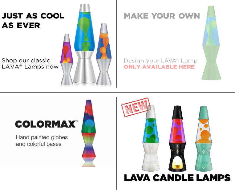
Market Research
After a short meeting, I researched competitors and found that most of them have very vibrant colors and retro graphic styles. Drawing inspiration from it, I decided to incorporate futuristic and vibrant brand concepts into the overall designs, targeting the 16-25-year-old demographic.

logo design
1. For the logo design, I sketched five conceptual rough designs based on initial process. I sketched different 5 designs to gather ideas, and then saved them in one image as a JPG file at a resolution of 150 PPI. I selected one logo that can effectively represent their brand names and products with creative design. This chosen logo stood out due to its unique vertical placement.
2. For the color theme, I selected three complementary CMYK colors: navy, yellow, red, and orange, while also keeping the client's request to incorporate the orange color. These were chosen to showcase their futuristic image, enhancing visual appeal and creating dynamic contrast.
3. For the font, to represent the sense of futurism in the design, I selected the FuturaPT font, and stylized text logo to glow, symbolizing the activation of the lamp.


business card design
With the completion of the logo, a 3.5-inch by 2-inch business card was designed. Its goal was to keep a consistency with overall product design by incorporating the logo converted to vector shapes. It was challenging to ensure readability and visual appeal, but to address this, I experimented with various design placements. I ultimately designed it by arranging contact information and logo against complementary brown and orange background colors to highlight them and enhance the aesthetic appeal.


Packaging Design
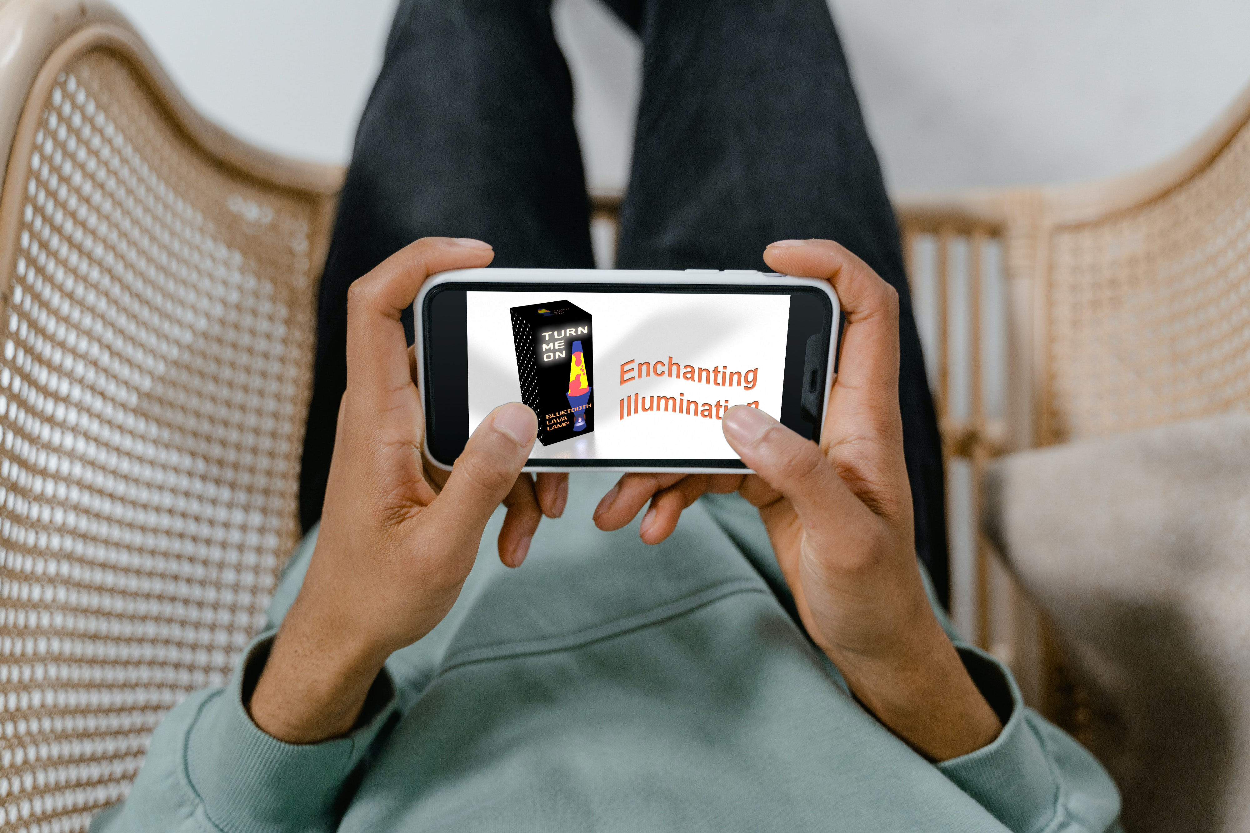
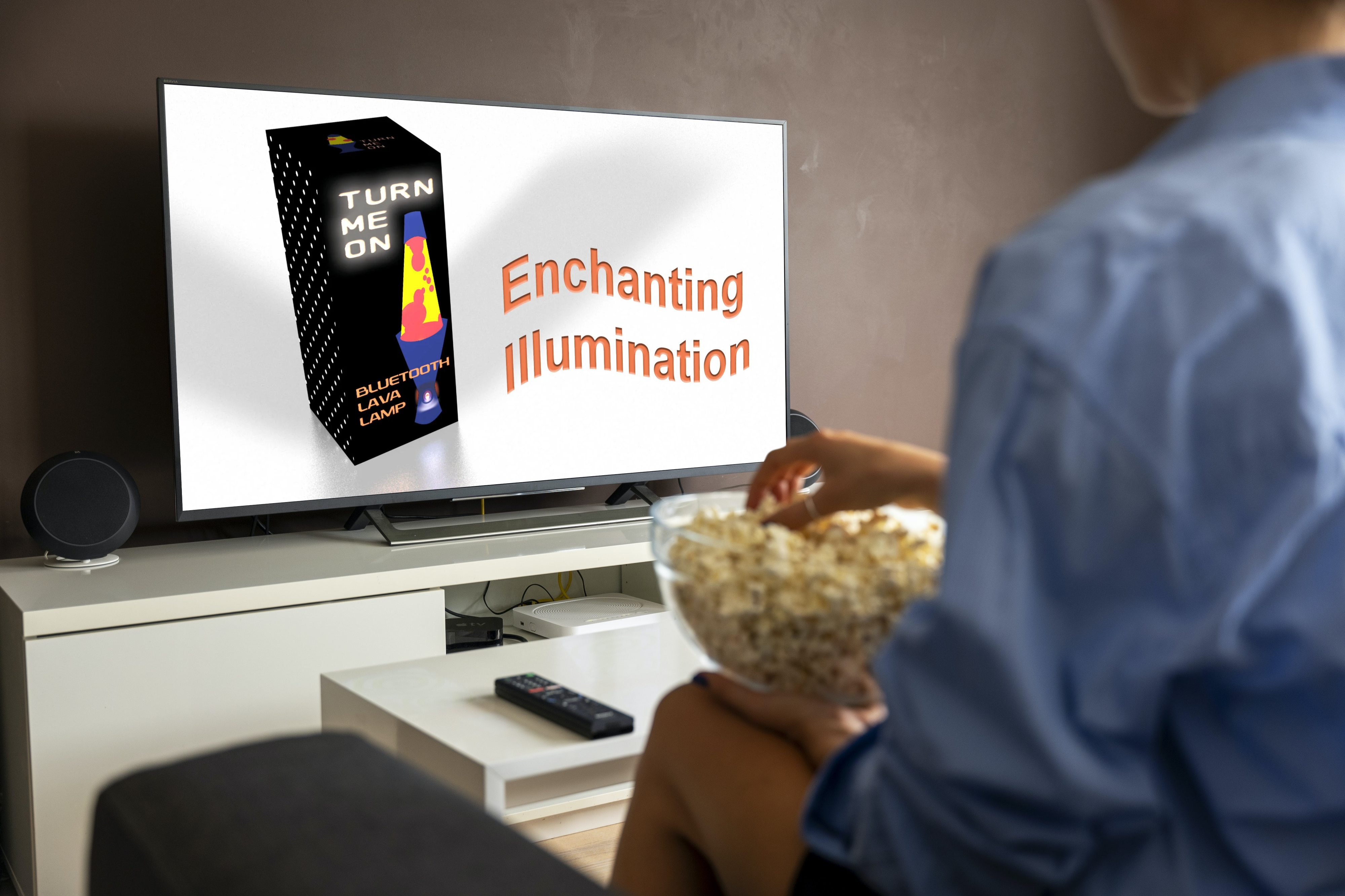
The next step was to design a boxed product packaging using Adobe Photoshop. Following the lamp specifications, the packaging dimensions were set to 5.0"W x 12.0"H x 5.0"D. The packaging design included a logo, product graphic, company name, sales details, and a dot pattern to enhance its appearance as a real product. The challenge was to seamlessly compose all the elements into the packaging design. To address this, I opted for a black background and created a simple dot pattern to improve the product visibility. Additionally, to add realism, I added fictional specifications, safety information, and contact details, along with a QR code and barcode images generated from a free online tool (https://barcode.tec-it.com/).


3D Scene Mockup
The final process was to create a 3D scene using a pre-designed boxed product packaging in Adobe After Effects. The packaging design, exported as rasterized images, was showcased with only three sides focusing on the most important aspects. The packaging design was placed on a surface with shadows and the product slogan 'Enchanting Illumination' featured as a banner.
Initially it was challenging to compose the packaging designs and manipulate them in the appropriate directions. After several trials, I found the solutions to adjust the distance to achieve the perfect sizing.
The goal of this 3D scene mock-up was to make people curious about this product and effectively convey the brand identity, creating an engaging and visually appealing presentation for potential audience.
Following the completion of the 3D scene mockup, various examples were created using free templates on Canva. It was intended to assist target audiences in better visualizing and understanding the product in a context that closely aligns with the real world.

Result from Project
The "TurnMeOn" project was successfully completed, meeting the client's goals and needs. It focused on creating eye-catching graphic designs and incorporating elements into the packaging design through 3D rendering. Through this project, I learned the importance of maintaining consistency in all related design products and the value of attention to detail during the creative design process.
CONNECT WITH ME
Let's make something great together!
Whether you have a project in mind or just want to chat about me and my design, free free to reach out. I am always open to new opportunities and collaborations!